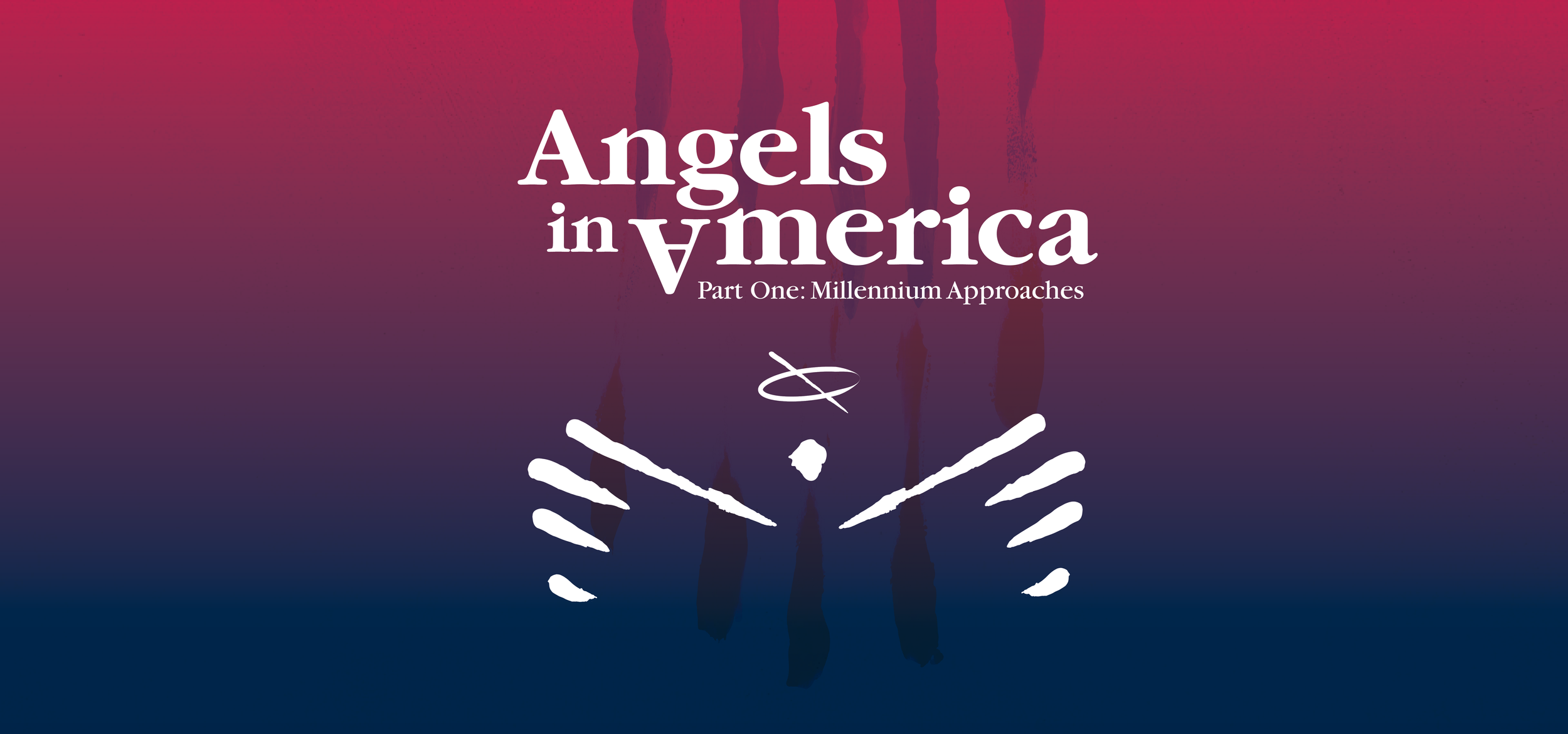
Angels in America Poster Design
Based on key themes important to the director, I designed a poster for the RIT College of Liberal Arts and NTID Performing Arts production of Tony Kushner’s Angels in America, Part One: Millennium Approaches. Emphasis was placed on hierarchy and addressing the dark, grungy tone and messaging of the play, which is centered around 1980s New York City and the AIDS crisis. After completion, my design was selected by the director from among a group of my peers to be used to promote the production. I then worked with the director and designed an audition poster, program, and social media graphics, which I updated after the play was postponed to 2021.
-
Poster Design
Program Design
Social Media Graphics -
4 weeks
February 2020 (updated Spring 2021) -
Angels + Disillusionment + Plague
FINAL DESIGNS
The production poster as chosen by the play’s director. The upside down A in “America” represents disillusionment.
Audition poster derived from the production poster
Design for the play’s program
Ultimately suspended until 2021, social media and digital promotion graphics with updated dates for auditions and showtimes.
PROCESS WORK
Key concepts from the director:
Angels
New York City in 1985
The AIDS crisis and sickness
Illusions and the abstract
Isolation
Beginning with sketches and a word list, trying to capture the angst, time, and place of the play
To bring in a texturized, grungy aesthetic to the poster to reference plague and the seedy New York of the 1980s, I experimented with finger painting and scanned in the results.
For the poster’s typography, I experimented with typefaces popular in 1980s advertisements. I also explored different layouts for the title, a main feature of the poster.
After taking it to digital compositions, I experimented with two layout ideas, one with the finger-painted angel dominant and ITC Garamond, and one with a cityscape and ITC Lubalin Graph.
After group and professor feedback, I moved forward with the larger finger-painted angel concept after realizing my cityscape concept was a bit too literal. I settled on a red and blue gradient (for America) and added a subtle concrete texture (for NYC) in the background. ITC Garamond for the title, and ITC Avant Garde for body text.
The final production poster seen on campus at RIT!
