Canteen Packaging System
Evolving from a concept produced as part of a previous team project with fellow design peers, Canteen is an infused water brand for which I’ve designed a visual identity and packaging system as a solo project. Canteen is geared towards those with an on-the-go lifestyle, from joggers and campers to businesspeople and travelers, who want an all-natural, flavored source of hydration. The goal for Canteen’s branding is to convey its simplicity in ingredients in an appealing and easily accessible way, with the help of a no-hassle, flexible individual packaging solution and visually consistent packaging system.
-
Packaging Design
Identity -
4 weeks
April/May 2021 -
Hydrating + Natural + Active
IDENTITY
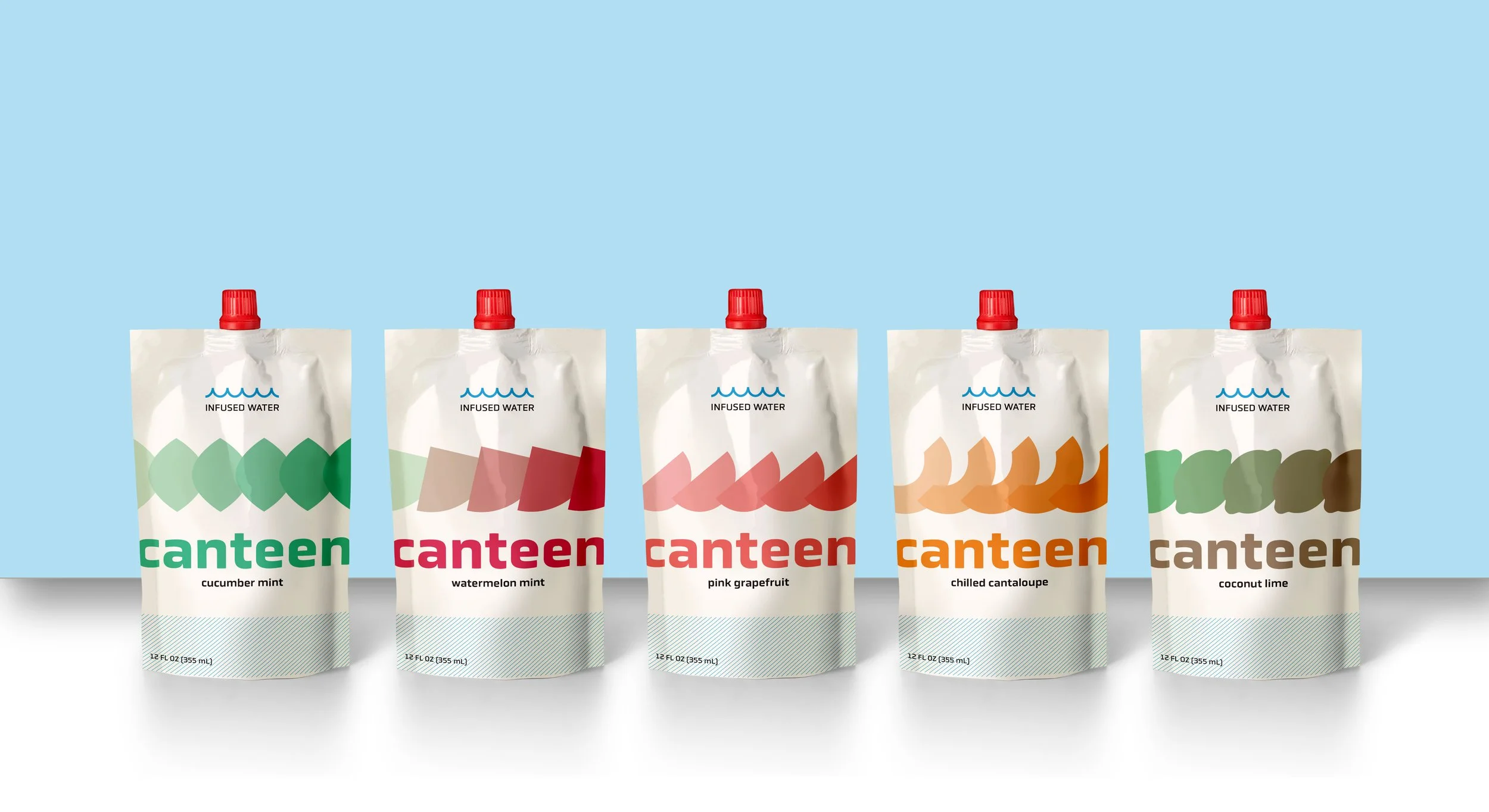
LOGOTYPE: Set in lowercase Obvia Wide to give an open feel, the name Canteen was chosen because of its status as a water vessel and relation to a natural, outdoorsy lifestyle. The main logotype is supported by “Infused Water” topped with waves as a product descriptor when called for.
ICONS and COLOR: Each flavor is given a corresponding shape and color to identify it across all packaging and other applications. Each color’s goal is to convey freshness while staying cohesive with the crisp blue representing the water itself in the main logotype.
PACKAGING SYSTEM
Individual Packaging
PACKAGING: Flexible pouches were chosen as a sustainable individual packaging solution to align with the on-the-go target audience. The pouches can be grabbed quickly, thrown in a bag without concerns about the pouch being crushed or taking up too much space, and resealed after opening.
DESIGN: Each individual pouch keeps it simple by using each flavor’s shape and colors to identify it, with the fruit shapes in gradients across the pouches meant to represent freshness and the flow of water. The packaging is also supported by a blue line texture and the waves above “Infused Water.”
Multipacks
The paperboard multipack boxes successfully fit 6 pouches, and were chosen as the multipack solution because they are recyclable and can feature a tear away top lid, allowing for quick and easy access to the pouches inside.
Point of Sale Display Concept
Designed to hold 8 individual pouches, this concept for a countertop point of sale display is perfect for the checkout at sporting goods stores.
Website Concept
The Canteen home page is an ideal place to show off its packaging to consumers.
PROCESS WORK
PREVIOUS TEAM RESEARCH AND IDEATION
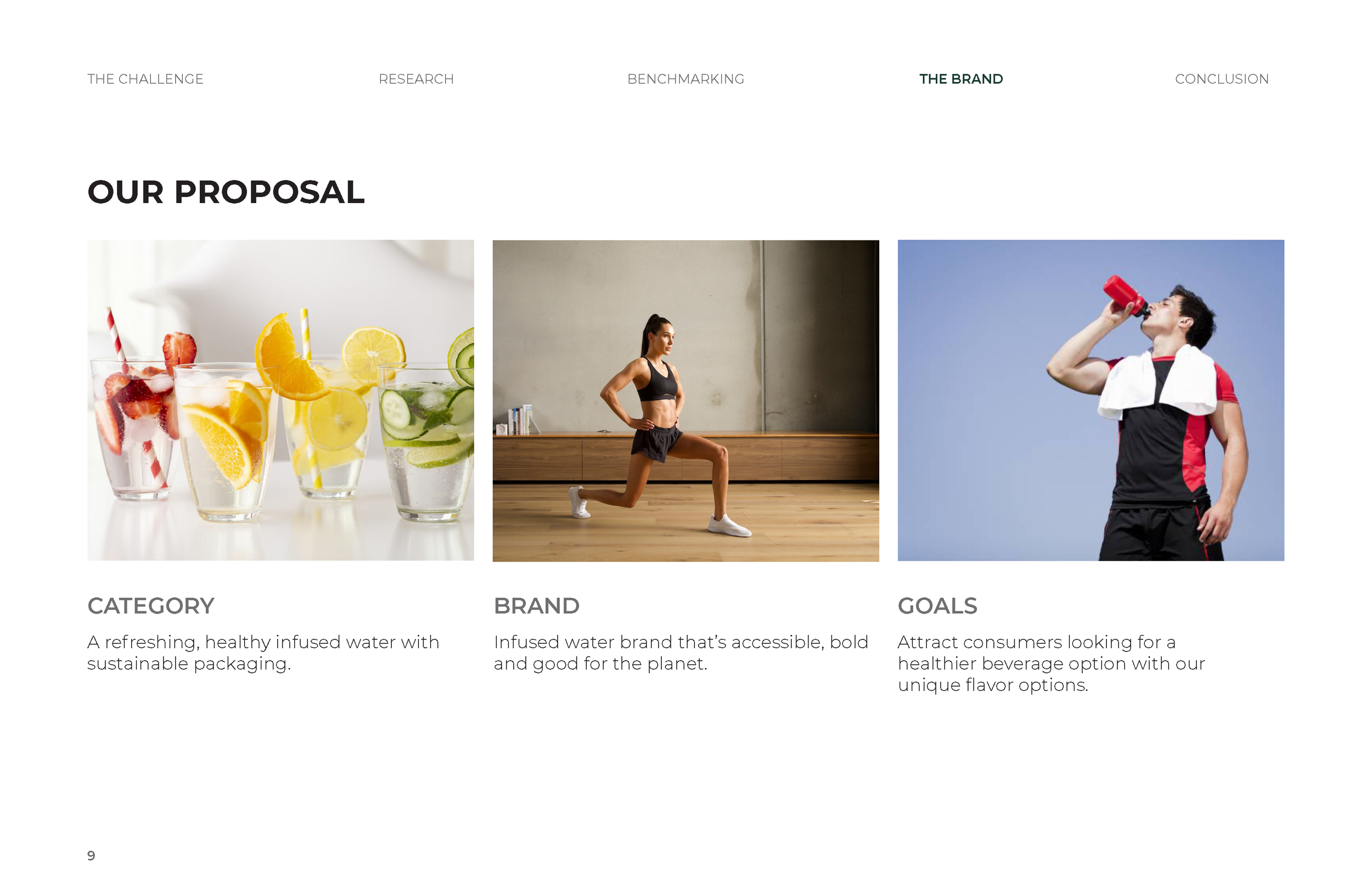
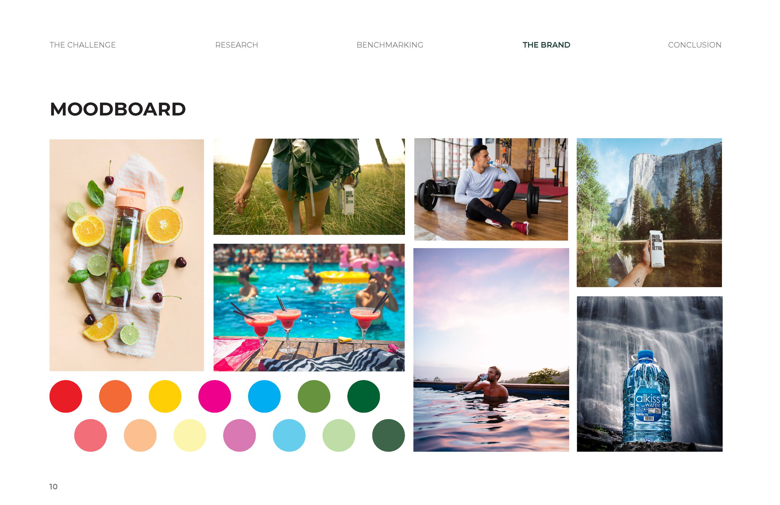
Previously, I was part of a team of fellow designers tasked with researching and coming up with a proposal for a new line of healthy drink products. We collaborated on researching opportunities and openings in the health drink market. We then narrowed down a specific problem to solve, conducted competitive analysis, discussed barriers, and finalized a concept. Together, we came up with a new infused water product targeting active consumers and prioritizing all-natural ingredients and health benefits. Below are slides from our final presentation.


