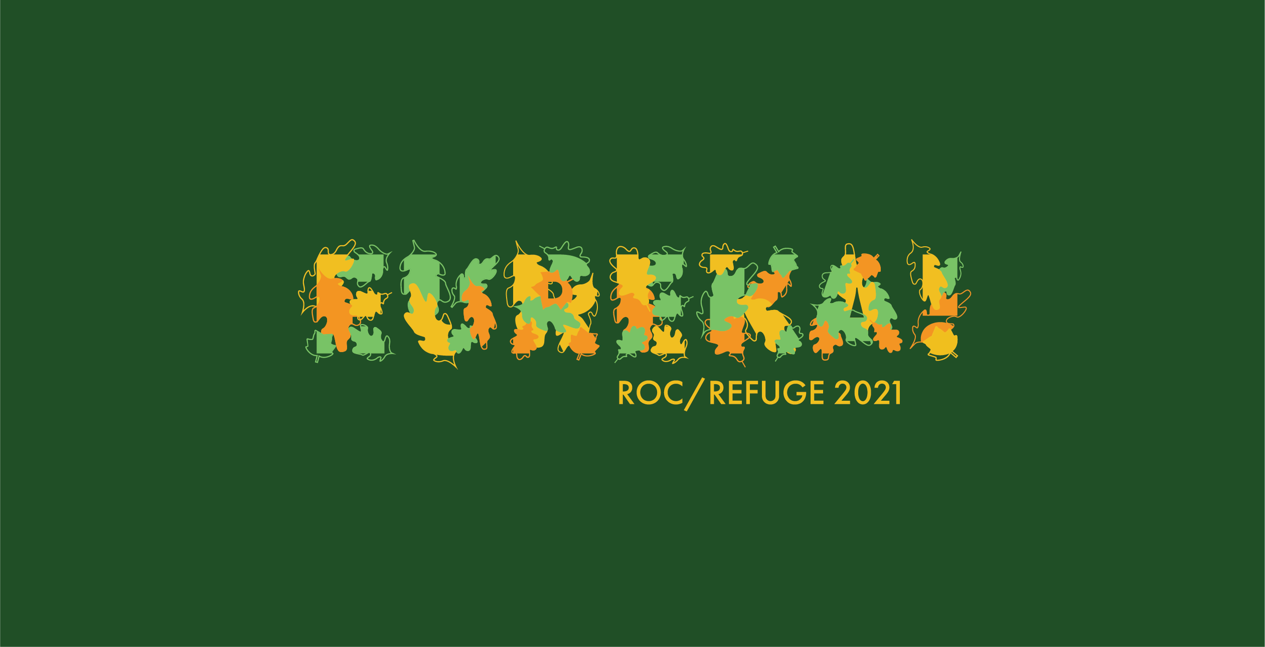
EUREKA! 2021 Identity
RIT’s EUREKA! is an annual team-based, interdisciplinary workshop that allows students to work with and design solutions for a local community organization. Selected by professors to be part of the event’s organizational team, I was tasked with designing the visual identity for EUREKA! 2021. This year’s theme was “ROC/REFUGE” in connection with the Friends of Washington Grove, an urban park in Rochester, NY. The goal: work with EUREKA’s predetermined typeface to create a unique identity featuring this year’s concept of nature meeting urban space.
-
Identity
Visual Assets
Motion Design -
3 months
August–October 2021 -
Nature + Urban + Community
IDENTITY
LOGOTYPE: Full color, with Futura PT giving a city-like structure to the arrangement of leaves coming together to form the EUREKA! name.
ICON: Full color, for multiple use cases including social media profile picture
Single-color logotype adapted for t-shirt printing
Circular sticker designs inspired by the nature and graffiti of Washington Grove Park
Promotional video featured on screens around RIT, on the EUREKA! website (eureka.cad.rit.edu), and at the EUREKA! kickoff event. An important deliverable, the video was an opportunity to show aspects of the park like animals and trails.
PROCESS WORK
After receiving the brief from the professors leading EUREKA! and going over info about Washington Grove Park, we discussed a few design ideas:
looking to photos of Washington Grove as inspiration
drawing from the park’s graffiti and urban location
using imagery of native plants, leaves, animals
continuing EUREKA!’s previous use of Futura PT for brand consistency
Photo by Erin Bush
Beginning with the key words like nature, urban, leaves, and community, I began with sketches. I kept in mind the appearance of Futura PT and started with finding ways of combining forest imagery with urban aspects of Rochester.
Going digital with my sketches, I received and implemented rounds of feedback from my professors. We established that representing Rochester itself wasn’t the way to go, and that including the natural, organic shapes of natives leaves was a key visual element.
THE BIG EVENT
Me (L), fellow designer Courtney Priddy (C), and event photographer Erin Bush (R) in front of the opening slide deck, presented to our full house of participants!
Courtney and I handing out t-shirts to participants
T-shirts that were handed out to workshop participants and facilitators
Printed sticker sheets handed out to participants
